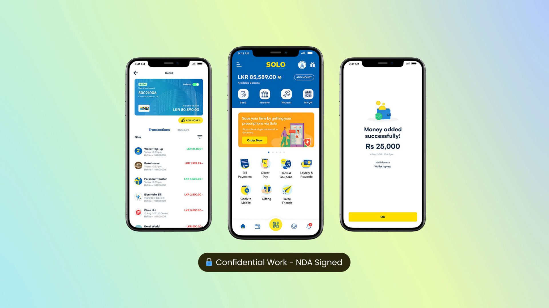
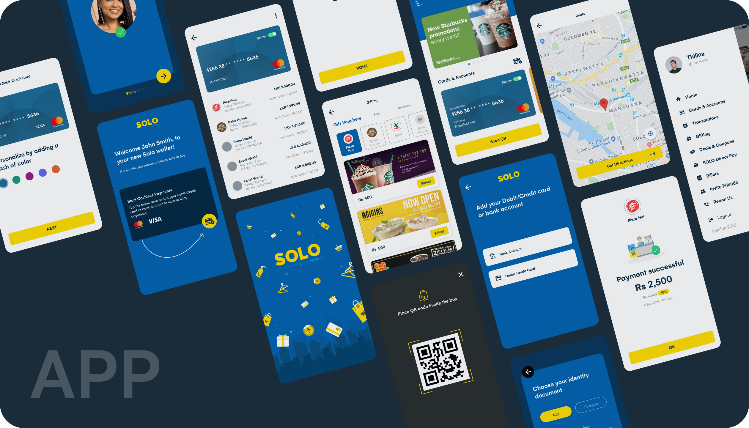
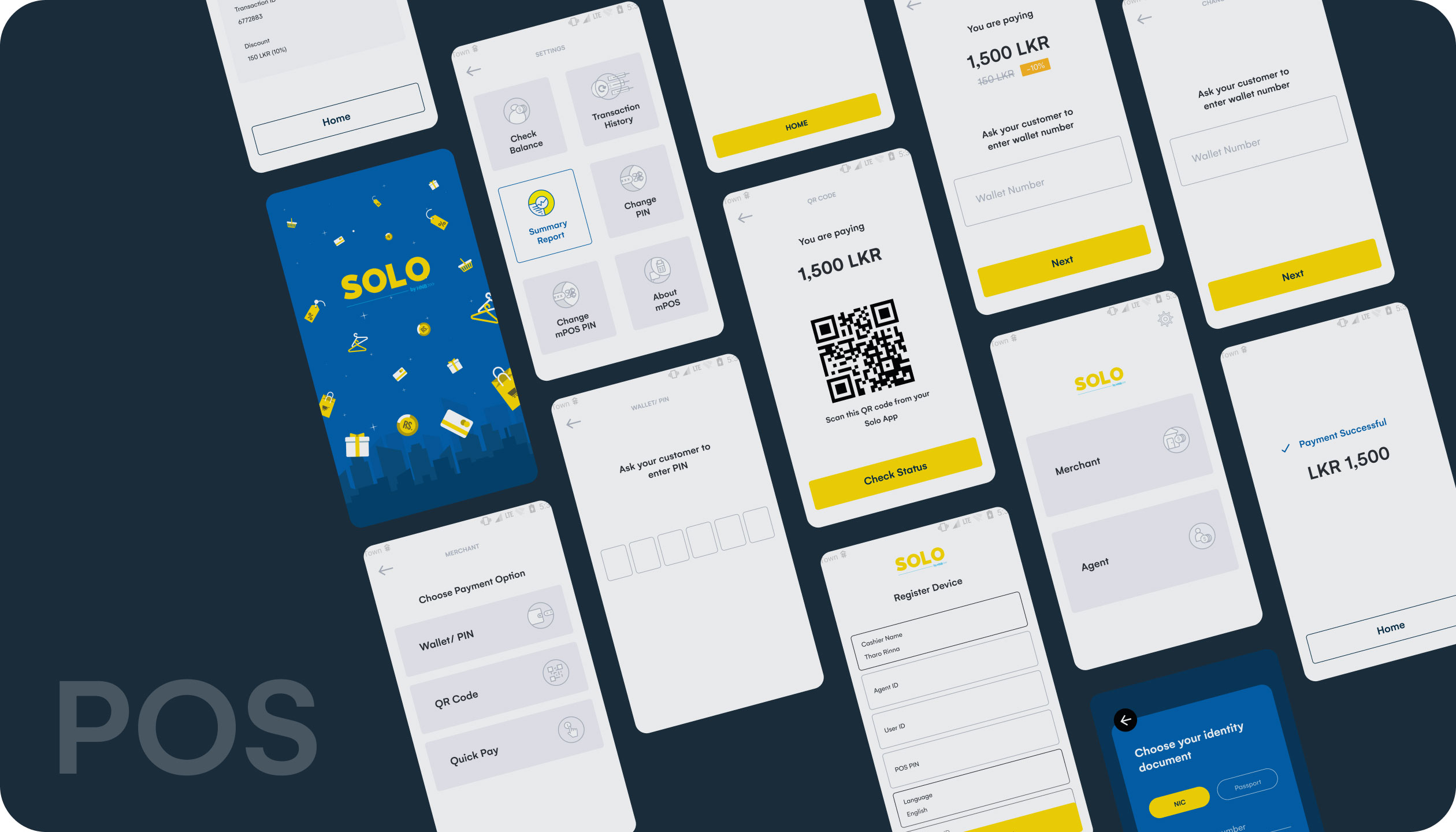
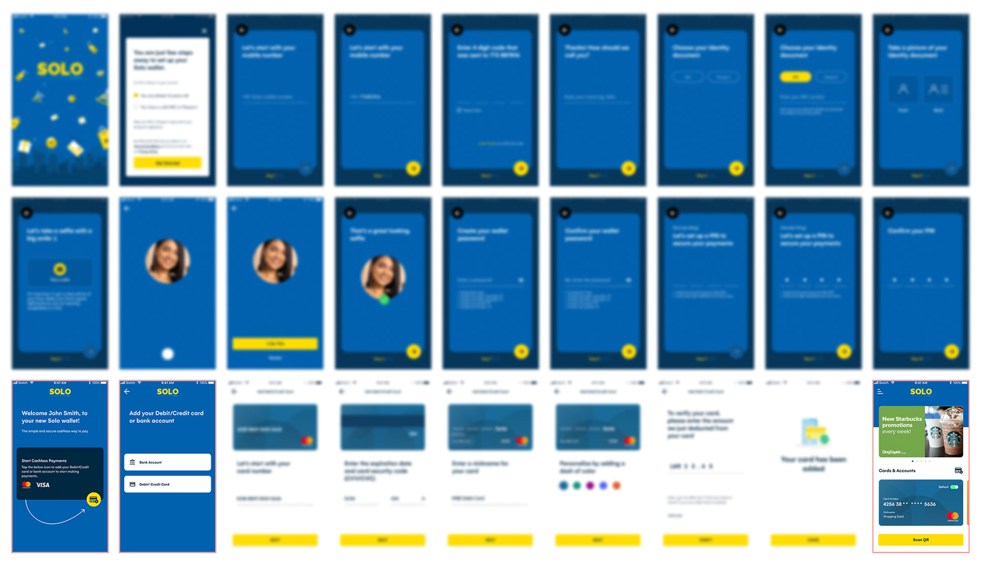
Redesigning & Implementation of a Virtual Wallet Onboarding
Led product design to introduce a virtual wallet system into one of Sri Lanka’s major banking apps.
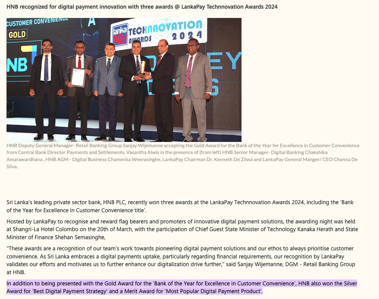
“Won the award of Best Digital & Customer Experience in 2024”
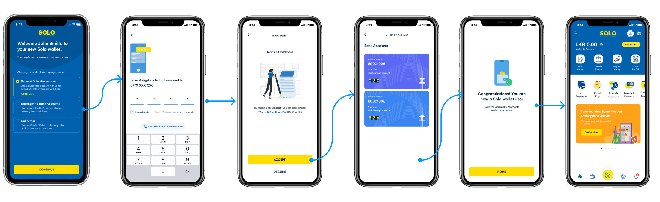
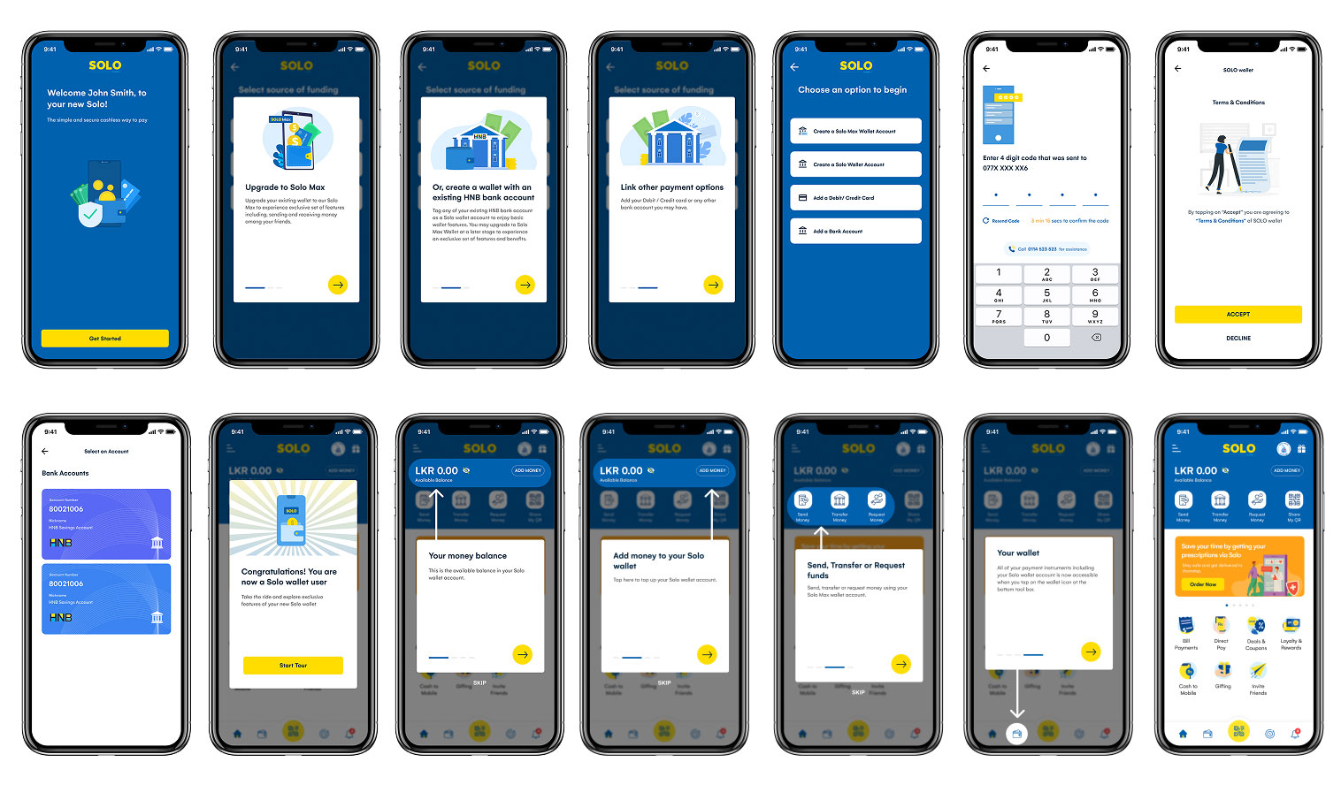
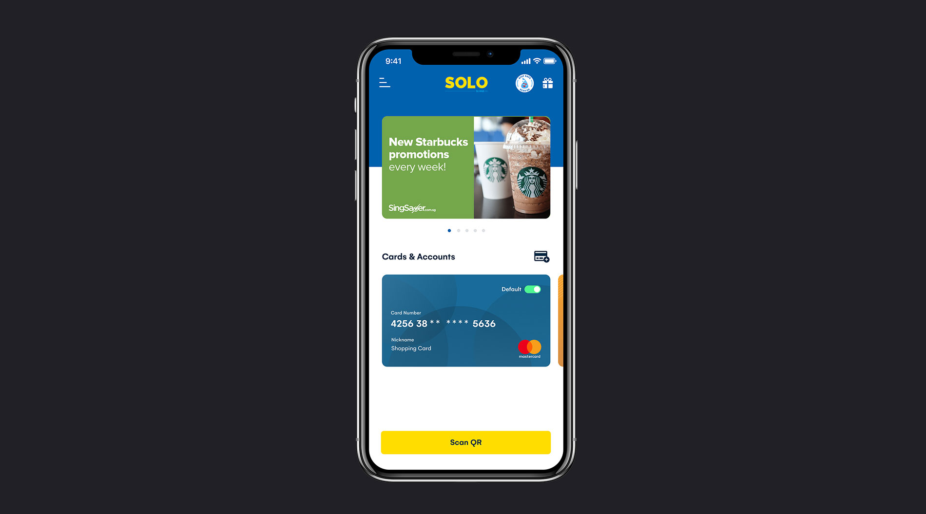
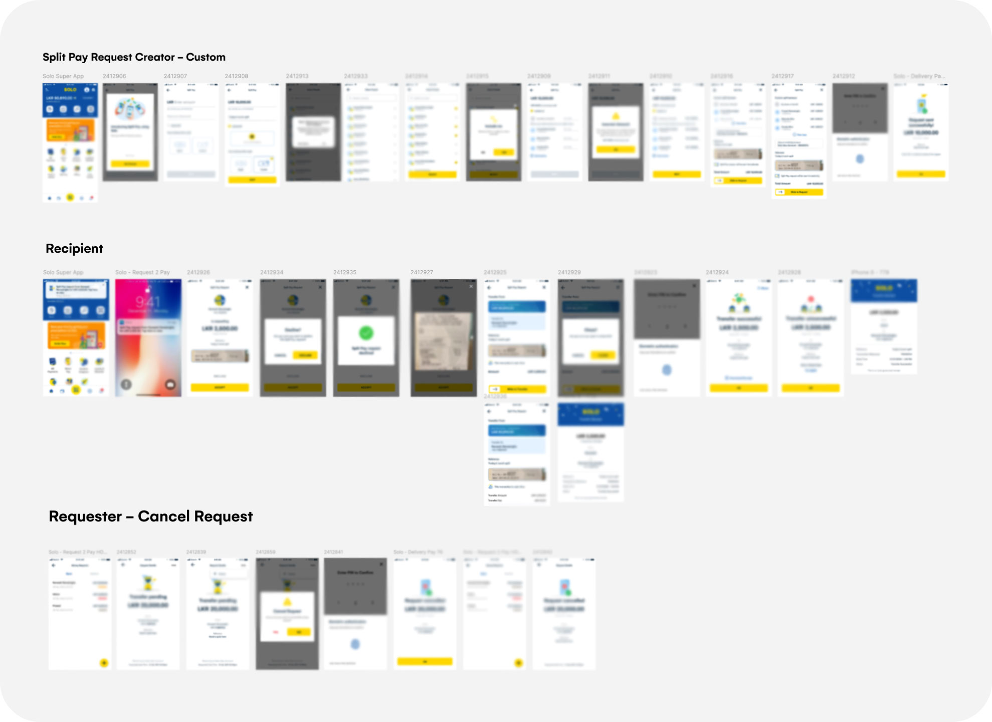
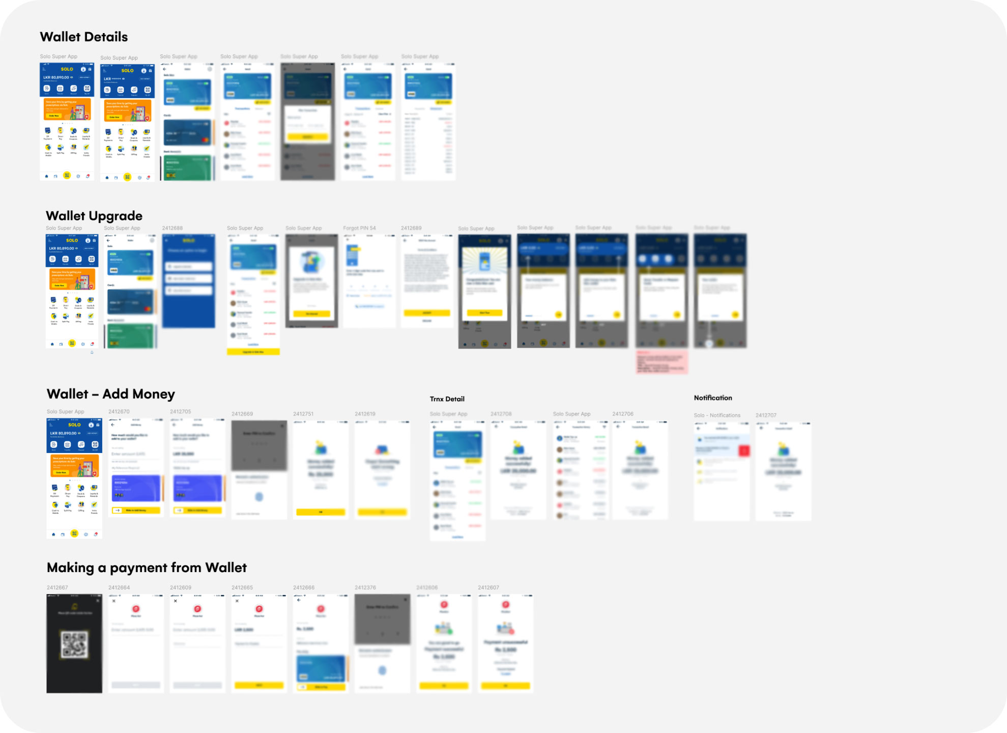
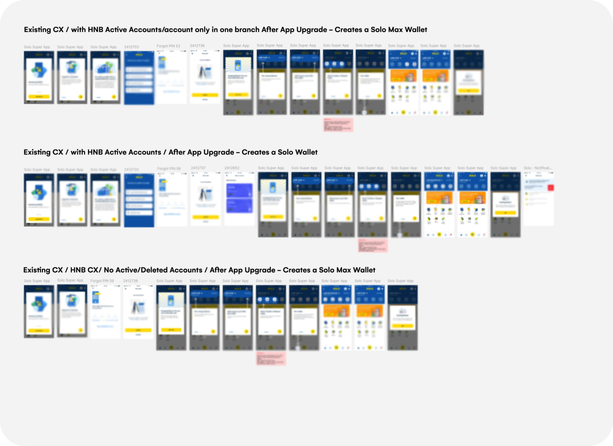
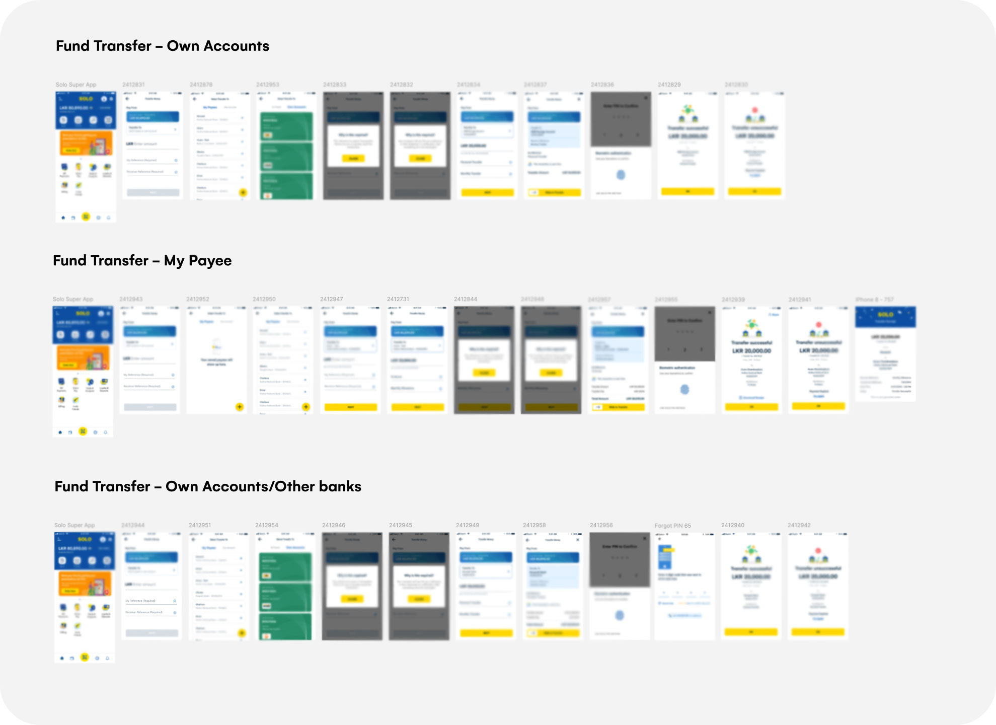
-
Timeframe
2022
-
Platforms
iOS, Android
-
Role
Senior UX Designer
-
Responsibilities
Research, Product Design Management, Visual Design, Prototype & Testing

To comply with my non-disclosure agreement, I have omitted and obfuscated information in this case study.
Overview
Solo is a QR-based payment app
designed to make
everyday transactions
seamless and convenient.
It allows users to make payments at merchant outlets using VISA, Mastercard, or any bank account.
This case study focuses on the implementation of the Virtual Wallet feature, arguably the most impactful update to the app since its launch.
This release introduced a major redesign of the onboarding experience and homepage, both of which were critical to supporting the new wallet functionality and improving overall usability.
At the time, I had already been deeply involved in the app’s initial redesign and successful launch (Phase 1), working closely with the bank’s Head of Design. I also led the UX and Visual Design for SOLO POS, the companion app used by merchants to generate QR codes, manage transactions, and configure settings.
When the bank’s Head of Design moved on to a new opportunity, I was promoted to Senior UX Designer and was tasked with the implementation of the wallet while ensuring a seamless update and consistent user experience across the app for both new users and existing users.
Project Scope
In phase 2, my core responsibility was to lead the UX and visual design for the implementation of a top-up based virtual wallet that expanded how users could make payments through the app.
Existing wallet setup options
Users can:
- Link debit/credit cards
- Add bank accounts from HNB or any other bank
New wallet setup options
Users can:
- Create a Solo Max Wallet Account
- Link an existing HNB bank account
- Link a debit/credit card
- Link a bank account from another bank
Additional features that will also be implemented
- Fund Transfers
- Send money directly from the wallet
- Split Bill Payments
- Share expenses with friends effortlessly
- Request Money
- Easily request payments from others
Goal
To enable users to manage funds through a secure virtual wallet, while also adding new features and all within a redesigned onboarding experience that’s seamless for both new and existing users.
Key Challenges
1. Complex user segmentation
User groups that needed to be considered:
- New vs. existing customers
- HNB customers with active, inactive, or multi-branch accounts.
- Non-HNB customers
Each group needed a clear, contextual wallet setup path without friction.
2. Existing UI limitations
The existing homepage design couldn’t accommodate the new wallet features. A full rethink was necessary to bring these actions forward while preserving core functionality.
3. Limited testing access
Due to privacy and compliance concerns, public user testing wasn’t possible. We adapted by testing concepts internally and with non-project staff from the financial institution.
4. Competitive pressure & first-mover advantage
While Solo was the second bank-backed app to offer a virtual wallet in Sri Lanka, it was still early enough to be a market differentiator. Unlike third-party fintech apps, this came with institutional trust, but also higher UX expectations. It had to be polished, educational, and forward-thinking.
5. Rolling out to 30,000+ existing users
At the time of the Phase 2 release, Solo already had 28,000–32,000 monthly active users. Ensuring a seamless transition for these users was critical. Any disruption could risk app churn, so I had to carefully design force-update flows, wallet setup guidance, and error handling for edge cases.
Understanding the existing onboarding & wallet setup flow
The existing process involved a lengthy KYC journey, which is a mandatory requirement by banking regulations. This step is essential for verifying user identities and determining whether they are existing HNB customers, a critical factor in delivering a personalised wallet setup experience. For privacy reasons, the onboarding and KYC screens shown here are blurred. The highlighted screen indicates where users begin setting up their wallet, and this entire flow will be changed as part of the new virtual wallet implementation.

Two concept sketches for wallet setup flow

Testing the first concept
We tested the first concept with internal non-project team and a few team members from the banking institution who weren’t directly involved in the project.
I conducted affinity mapping with my team to synthesis the pain points identified. While the design aimed to be quick and simple, feedback revealed that users struggled to understand the options presented at once even with supporting descriptions. The feedback helped us realise that simplicity alone doesn’t guarantee clarity.

Gathering feedback
So we decided the test second concept and since we already identified few user problems that was not taken to account when I initially sketch the wireframes for the second concept we did introduced a Joyride to even further help users with the adoption of the new wallet features.

Validating the second concept
After identifying the shortcomings of the first approach, we moved forward with testing the second concept. This time, the flow was more guided and intentionally broken down into smaller steps to help users better understand their options. Based on the pain points uncovered during initial testing, we made key adjustments to improve clarity.
One of the most impactful additions was the introduction of a Joyride, designed to guide users through the new wallet setup and highlight the key features of the virtual wallet. This helped ease adoption and reduced confusion, especially since this was a major shift for existing users.
The feedback we received from internal non-project team members and the team from the financial institution was positive. Users found the step-by-step approach easier to follow and appreciated the added guidance. Based on this, we made the decision to proceed with Concept 02 for the final implementation.

Why redesign the homepage?
With the introduction of the virtual wallet and its extended capabilities such as fund transfers, split bill payments etc it became clear that the existing homepage structure could no longer support these new features effectively and it would just hide these features under the menu.
Given the importance of these new wallet functionalities, I wanted to ensure they were easily accessible within one tap. Moreover, we needed to surface contextual wallet information such as available balance.
The redesign focused on:
- Improved visual hierarchy to prioritise wallet features.
- Quick access to top wallet actions like fund transfer, request money and many more.
- A cleaner, more intuitive layout to guide returning users through what’s new without overwhelming them.


Sneak Peak into the entire project scope
Due to privacy and NDA constraints, I’m unable to share the full details of the project scope. However, here’s a quick overview that offers a glimpse into the scale and complexity of what was delivered. From managing multiple user journeys for both new and existing customers to implementing key wallet features like top-ups, fund transfers, bill splitting, payment requests, and wallet payments. This project required a lot of thoughtful design, collaboration, and yes… some serious hustle under tight deadlines.
Results after 3 months
These numbers reflect not just a technical upgrade, but a user experience improvement that successfully boosted engagement, usage, and growth without disrupting the existing user base.
Before
App Installs
Monthly Active Users
Monthly Transactions
App Rating
After
App Installs
+33%
Monthly Active Users
+12.5%
Monthly Transactions
+38% to 69%
App Rating
+0.3
Key learnings
- Designing for compliance and complexity
Working in a regulated financial space pushed me to balance simplicity with legal and operational requirements — especially when integrating KYC flows and backend constraints. - Minimising disruption while scaling functionality
Introducing a major feature into an app with thousands of active users taught me to be cautious with flow changes and prioritise education, guided experiences, and progressive disclosure. - Iterating beyond the UI
The first onboarding flow seemed “simpler” on Figma, but real-world testing showed comprehension gaps. Our pivot to a multi-step journey with feature walkthroughs improved clarity, reinforcing the value of experience over minimalism. - Deep cross-functional collaboration
Working closely with BAs, PMs, and devs helped shape realistic, feasible, and user-centered solutions. Early collaboration with engineers saved us time and their point of view really helps to come up with better solutions. - Don’t worry too much about detailing
Earlier in my journey, I obsessed over the UI too soon. This project taught me to zoom out, focus on the flow first, and polish UI once direction was validated.


