
When I started designing for fintech products, I quickly realized something: a beautiful interface means nothing if users don’t feel safe using it.
In sectors like banking, payments, or investments, users aren’t just tapping through screens — they’re trusting us with their money, identity, and sometimes even their future.
The real job – designing for trust, clarity, and confidence
Fintech UX has a unique weight to it. Every design decision must balance:
Trust vs. Simplicity
We want the interface to look simple and feel easier to use, but not too “playful” — people need to feel like their money is in serious hands.
Speed vs Accuracy
We want simple user flows without creating risk for errors. Imagine rushing a bill payment or mistakenly entering a decimal point in a transfer.
Functionality vs Overload
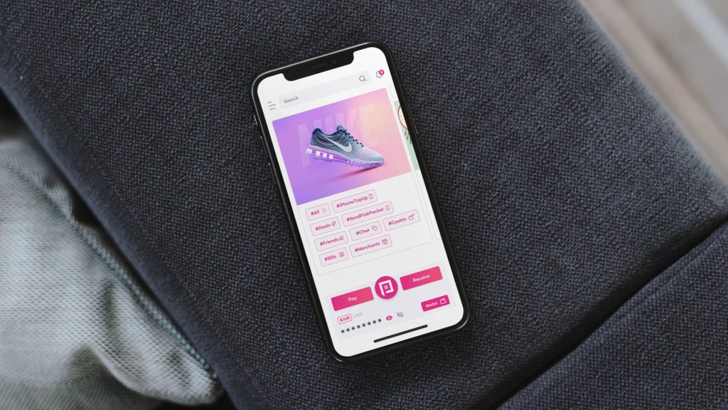
Many fintech apps are bloated with features — QR pay, account switching, split bills, fund transfers, top-ups, and more. But when everything looks important, nothing truly is. That’s why it’s essential to talk to users and analyse behavioral data to identify which features are used most often, then design the interface to make those actions easier to access.
Micro moments that matter in Fintech UX
Some things I always keep in mind:
- UX writing that makes financial language human — e.g., “Available to spend” instead of “Credit balance”
- Visual cues for security (lock icons, verified labels, masked inputs)
- Responsive feedback (clear animations and progress indicators for transactions)
- Readable typography (especially for sensitive details like balances or due dates)
Final thought
Fintech design isn’t just about designing an interface for people to interact with — it’s about building confidence in every tap.