
💼 Project Type: Mobile fintech wallet
🔐 NDA-Protected: Yes — all names and visuals are anonymized
🎯 My Role: UX Designer
Introduction
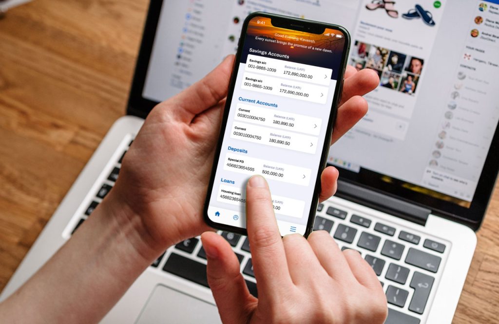
This project marked my first major venture into the fintech space. While I can’t reveal the app’s name due to an NDA, I stepped in to manage and continue developing its design after another designer laid the initial groundwork. I joined the team just a year into my UI design career, and though I didn’t fully understand every decision at the time, I deeply respected the work that had been done.
Fast forward three years, and I’ve gained a much richer toolbox of UX principles, user-testing strategies, and mobile-first best practices. Here’s a look back at the original home screen’s pain points, and how I’d tackle them today.
Usability challenges
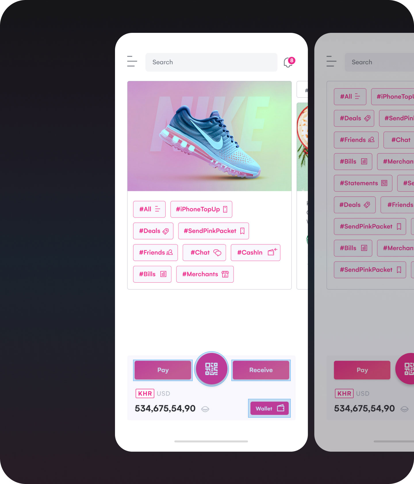
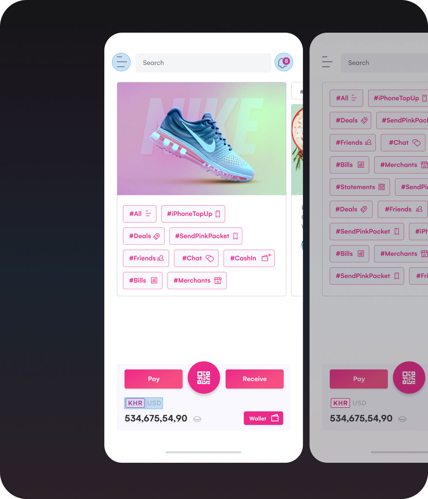
1. Too many primary actions
What it looked like: Four equally prominent buttons, all sharing the same primary colour, crowded the top half of the screen.
Why it’s a problem: By equalizing every action, we inadvertently created decision fatigue. According to Hick’s Law, offering too many choices increases the time it takes for users to decide—and in a payments context, hesitation can destroy the trust.
Lesson learned: Not every feature needs top billing. Prioritize based on frequency, user intent, and business goals.
2. Interaction zones needed breathing room
What it looked like: The menu icon, notification icon, and currency switcher were all tightly packed, which can result in frustration when tapping.
Why it’s a problem: Fitts’ Law teaches us that smaller targets take longer (and are more error-prone) to hit. Meanwhile, using the same primary colour for dozens of tappable “#tags” further confused which elements were truly interactive.
Lesson learned: Clear and generous tap zones. Every interactive element should signal its purpose, and when too many items compete visually, users lose focus.
3. Lack of visual cues for interaction
What it looked like: The currency switcher blended into the background, hiding its interactivity. The wallet-balance info was nestled among buttons rather than set apart.
Why it’s a problem: This is a breakdown in affordance—a core UX principle that helps users understand what they can do just by looking. This can be especially risky in fintech apps, as unclear controls may affect trust and efficiency.
Lesson learned: Interactive components must visually suggest interactivity. Adding subtle design cues—like shadows, outlines, or hover/touch feedback—helps users understand what to do next without needing instructions
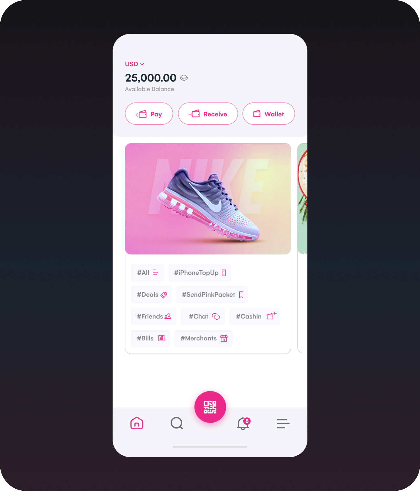
What I’d do differently today
Introduce a bottom navigation bar
- Moves 3–5 core actions into the thumb zone, making one-handed use much more comfortable.
- Deprioritizes secondary features into a “More” menu, reducing cognitive load.
Separate wallet balance from actions
- Place the balance in the top-left corner, away from buttons.
- Creates visual hierarchy—users see their balance at a glance, then choose an action.
Enhance clickable areas & affordance
- Use a secondary color or outline for tags, so they don’t compete with primary CTAs.
- Add subtle shadow effects or use primary colour, combining with UI elements to make tappable elements easier to identify.
Validate with real users
While these changes reflect best practices and my evolved design thinking, no design is complete without feedback. Usability testing remains essential to validate assumptions and refine solutions based on real user behavior.
“Design is never done—it evolves with data, context, and growth.”
Takeaways
Reflecting on this project reminded me how clarity, hierarchy, and trust are non-negotiable in fintech design. Visual design means little if it doesn’t support intuitive, confident decision-making. As I grow from designing screens to shaping product experiences, I’ve learned that every design choice, no matter how small, must earn its place by making the user’s journey simpler, faster, and safer.
