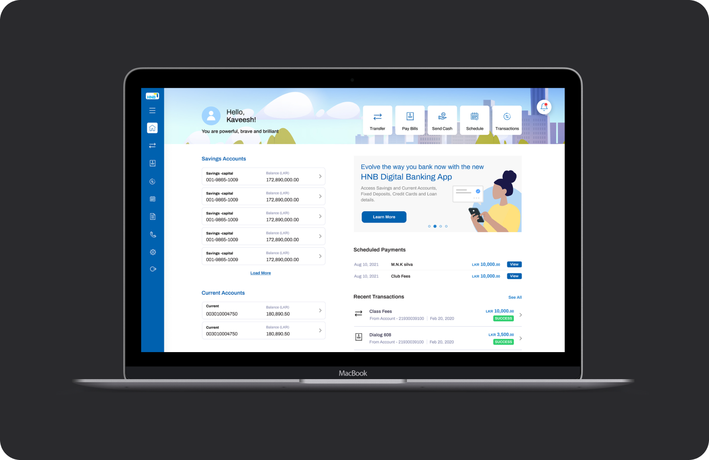
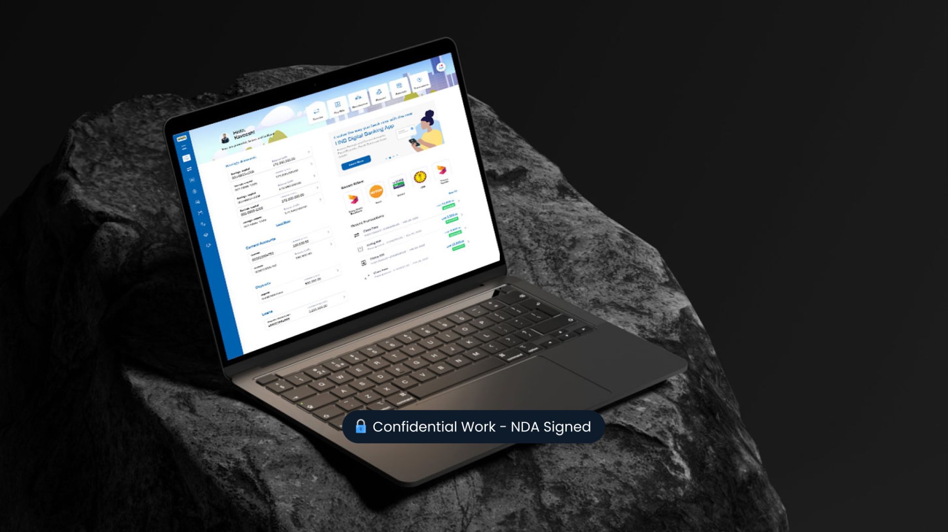
Redefining Personal Online Banking for Everyday Users

A deep dive into rebuilding an outdated banking portal into a cohesive, user-first platform across web and mobile.

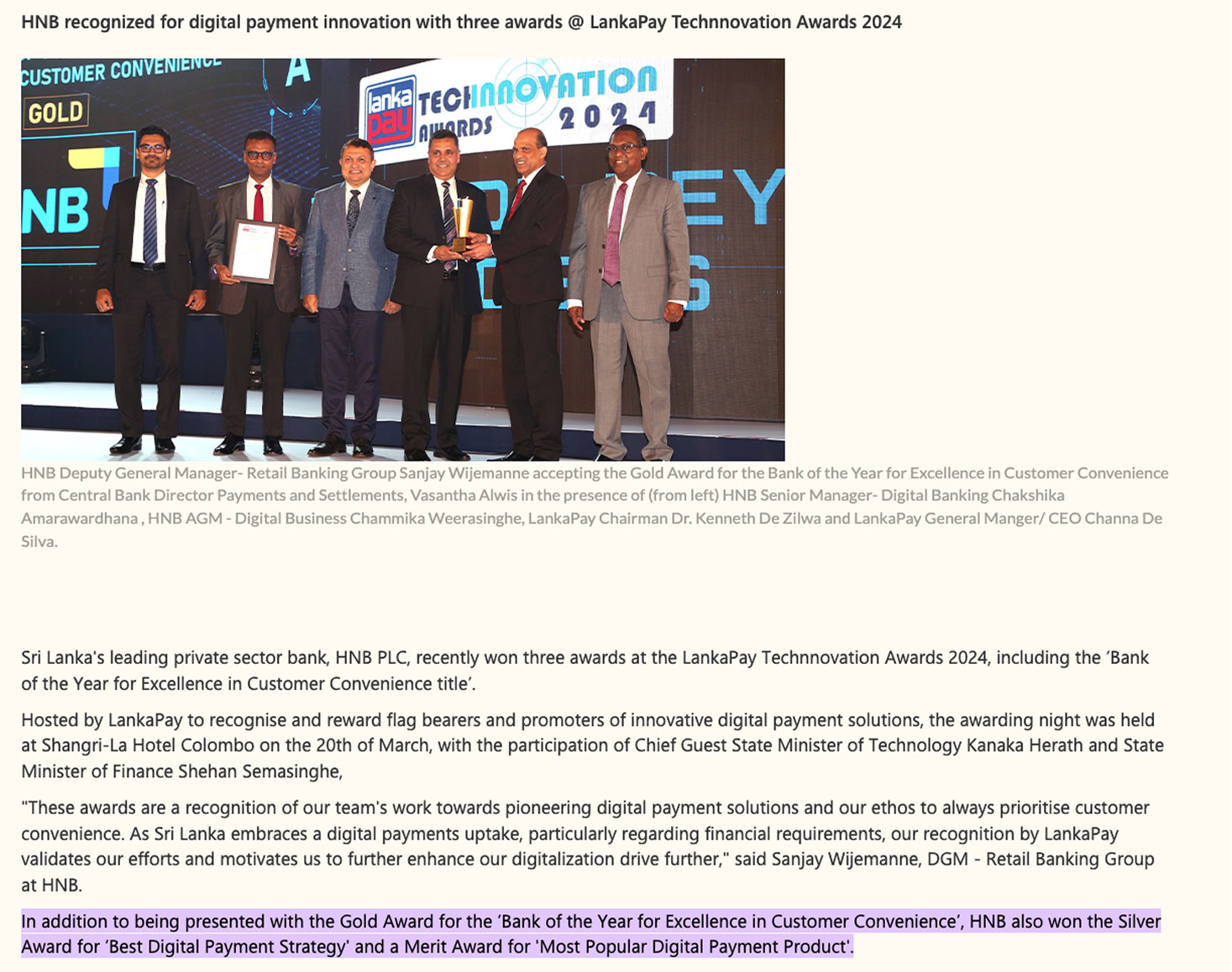
“Won the award of Best Digital & Customer Experience in 2024”

  • Timeframe

    2023

  • Platforms

    Web

  • Role

    Senior UX Designer

  • Responsibilities

    Research, Product Design Management, Visual Design, Design QA

To comply with my non-disclosure agreement, I have omitted and obfuscated information in this case study.

Overview

HNB is one of the largest privately
held banks in Sri Lanka with 200+,
branches nationwide.

HNB’s online banking was split into two key areas: Personal and Corporate Banking. Both were long overdue for a complete redesign.

HNB had adopted a mobile-first strategy and launched a new personal banking app last year. And I had been a part of this project from concept through to launch.

With the app receiving overwhelmingly positive feedback, they chose to focus on the Personal Banking portal since they wanted to build a better experience for users.

The existing platform suffered from outdated UX patterns, poor information architecture, and an inconsistent visual language.

Having worked closely with HNB’s former Head of Design on both the mobile banking app and the SOLO app, I was trusted to lead this new initiative.

Although this was my first time designing for a large-scale web banking platform (after mainly working on mobile fintech apps), I was excited by the challenge.

By then, I had already worked on three major fintech products and felt confident in my structured, user-first approach.

I was the Senior UX Designer, responsible for redesigning the entire end-to-end personal online banking experience from research and journey mapping to UI design, stakeholder presentations, and design QA

I worked closely with our internal teams and maintained constant collaboration with key decision-makers at the bank to ensure everything stayed aligned from concept to launch.

Team organisation

Aligning vision with real-world needs

While the workflows of retail and commercial customers vary significantly, their goals remained the same: to seamlessly manage finances, access essential features easily, and onboard with minimal friction.

The bank’s goal was to build long-term trust, increase adoption, and streamline operations. Rather than improving the outdated web platform, they chose to keep the user journeys and structure similar to mobile app so that users get a consistent experience across platforms. This allows users to comfortable switch between web and mobile without relearning the system.

💡 “The future of banking isn’t just mobile or web, it’s seamless, unified, and built around real people’s lives”

⚡ Product vision & goal

Build an experience users could trust, love, and use interchangeably across mobile and web, with minimal friction and maximum consistency.

To position ourselves as a digital leader, we focused on five key principles.

Customer Obsessed

Speed with Purpose

Think Beyond Banking

Data Driven

Built on trust & security

Key Challenges

1. Fast-moving, parallel development

Due to tight deadlines, design and development had to run in parallel. I had to work closely with engineers to ensure design feasibility and repurpose existing APIs and reduce iteration time.

2. High collaboration, multiple stakeholders

Maintaining constant communication with project managers on both the internal and banking side was essential to stay aligned on scope, timelines, and evolving priorities.

3. Consistency across platforms

To deliver a seamless omnichannel experience, we needed to align the web journey with the recently launched mobile app, without compromising platform-specific interactions.

4. Phased delivery, holistic thinking

Due to the large project scope, the rollout was divided into multiple phases. As the senior designer, I had to keep the full end-to-end experience in mind, while designing modular UI patterns that could scale with future releases.

Few screenshots of existing online banking platform

Example user journey of password recovery in existing platform

Starting with the questions

We created a list of “How might we…” questions to align the team around user and business needs.

How might we create a consistent, unified experience across web and mobile platforms?

How might we design flexible UI components that can accommodate future feature rollouts without disrupting the experience?

How might we provide an experience that is engaging and valuable to our customers?

Building empathy

As we transitioned from mobile-first to a consistent omnichannel experience, we needed to deeply understand how users interacted with the existing online banking portal, which was outdated and significantly different from the mobile app.

Our research revealed three major user types:

  • Young professionals balancing personal finance and early career growth.
  • Small business owners who rely on web access for daily operations.
  • Elderly users who prefer web banking for familiarity but struggle with usability.

For this redesign, we focused on young professionals and small business owners, whose digital expectations were higher and whose needs were more urgent. 

Competitive analysis

We reviewed four direct competitors in the banking sector to benchmark their online banking platforms. Key takeaways:

  • Most offered basic features like fund transfers, bill payments, and account summaries but lacked modern UX and good responsive design.
  • One competitor stood out in usability, based on online reviews and customer feedback.
  • A few allowed users to generate downloadable receipts and PDFs from transaction history, a valued but often missing feature.
  • There was little consistency between mobile and web platforms, creating a disjointed omnichannel experience.

These findings reinforced the need for HNB’s online portal to deliver a seamless, user-friendly experience that matched the mobile app’s success.

Design strategy workshop

We mapped usability pain points in a workshop, prioritising them by task criticality, user impact, and frequency to inform phased releases.

How we prioritised release phases?

To make strategic decisions on what features to release first, I relied on a data-driven approach known as the severity framework to guide prioritisation based on actual user pain points and business value. However, these release phases were not solely dependent on this framework, it included more input from banking side stakeholders, development team and business goals.

Severity = Task Criticality × Impact × Frequency

  • Task Criticality – How essential is the task to the user? (1 = low importance, 5 = mission critical)
  • Impact – How much does the issue affect the user’s ability to complete the task? (1 = minor suggestion, 5 = complete blocker)
  • Frequency (%) – How often does the issue occur across users or sessions?

Elevating product quality through Design QA

In majority of companies/teams, the flow looks something like this

How I made sure we deliver the best quality

Visual design

Digital banking app vs online banking

Before After
Key learnings

1. Clear communication makes everything smoother

With multiple teams involved from developers and QAs to stakeholders on the bank’s side, I learned how vital it is to keep communication open and simple. Regular catch-ups helped us avoid misunderstandings and stay aligned, even during fast-moving sprints.

2. Design decisions need business thinking too

It’s easy to get caught up in creating the “perfect” design, but I was constantly reminded that great UX needs to work within business constraints. I had to balance user needs with what was technically and commercially viable, which helped me grow stronger as a product thinker.

3. You don’t need to do everything at once

The scope was massive, but we had to phase the rollout. This taught me how to think modularly and planning a scalable experience that worked now but could grow later.

4. Understand what’s technically possible

Because many APIs were reused from the mobile app, I had to work closely with both mobile & web developers to understand what was feasible. This helped me dive in-depth into gain more technical knowledge of the product.

5. Consistency builds trust

By aligning the web and mobile journeys, we made the experience feel familiar and easy to use. This gave users more confidence and reduced friction.

Real impact is rewarding

As a proud moment for the entire team, the redesigned personal online banking experience played a key role in HNB winning the Best Digital & Customer Experience Award in 2024, recognising the impact of thoughtful design at scale.

Go Back